April 18, 2024
Playing a little with coloring of Mrs.G comic number 5
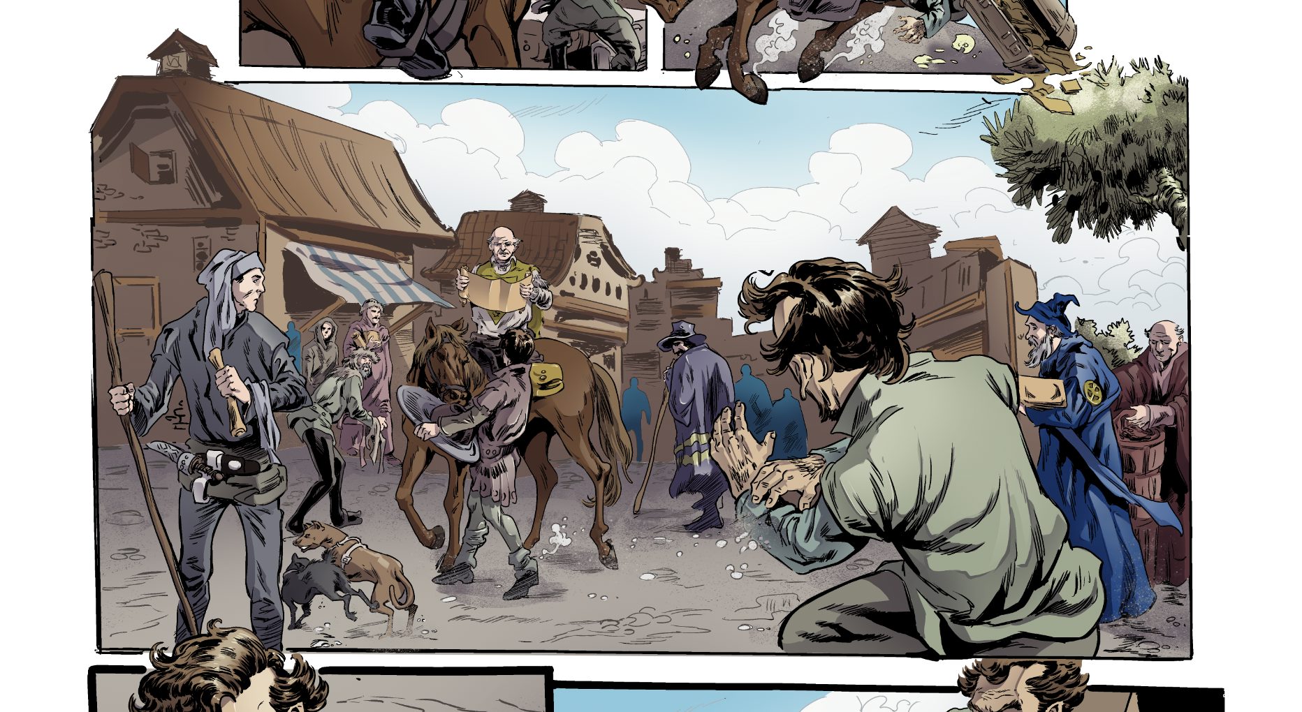
I'm getting the colored pages from my colorist, but while I think he is doing a great job, I'm afraid it will be somewhat busy and not quite easy to read.
So, I'm trying to figure out a way to make the important parts stand out, after which I will get back to my colorist with the instructions, and the second image is a bunch of things I did on it which I think might help a lot.
The things I did are:
• I made the lines of the background objects (houses), more subtle - less dark, and did a little "diffuse" filter , which makes the lines little "noisy"
• I lowered the saturation of the background objects, and made them lighter, as well I did them go towards "cool" colors - I added a "greenish" tint over it
• I lowered the contrast of the background objects ( that is - the highlights and shadows are not as prominent)
• For the people in the foreground, but which are not important, I lowered their saturation, and made them darker, and also lowered the contrast
• For the central figures - the little guy Finnick and the guy on the horse, I moved them towards "warm" colors, by applying redish tint to them.
What do you guys think? Is it better? Worse?